Logo Usage Guidelines
The AdsPower logo, wordmark, and symbol are important expressions of our brand identity. It is vital that that they are always applied consistently. These few simple rules will help you use our logo, wordmark, and symbol to communicate the AdsPower brand most effectively.
Logo, wordmark and symbol
The AdsPower logo is our primary graphic device. These are standard logo combinations, and all of them should always be with two uppercase letters “A” and “P”.

Horizonal combination (black) Horizonal combination (white)

Vertical combination (black) Vertical combination (white)
Incorrect usage of the logo
1. Do not change the space between the symbol and the wordmark.
2. Do not rotate the logo.
3. Do not apply colors.
4. Do not apply gradients, shadows, or other effects.
5. Do not change the color of the logo.
6. Do not outline the logo.
7. Do not use a low-resolution logo.
8. Do not deform the logo.

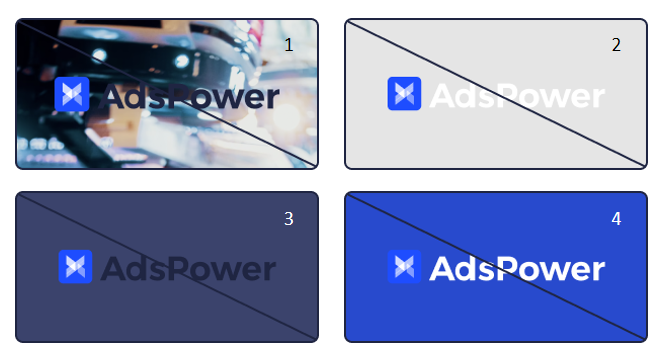
Incorrect color usage
1. Do not use the logo in a complicated background.
2-4. Do not put the logo on colors similar to any part of the logo.

The logo provided by AdsPower should only be used on websites, marketing materials, and product schemes. Resource of the logo should be demonstrated as the AdsPower website (https://www.adspower.com/). The logo can be resized without aspect ratio being changed, but cannot be modified or altered. AdsPower®, AdsPower logo® are trademarks of AdsPower registered in Hong Kong SAR. No one is allowed to use these images for any other purpose without AdsPower's consent.


